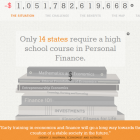
This microsite from the Council for Economic Education is my favorite Awww Award-nominated site of the week.
Besides the obvious fact that it’s fun to navigate, what I also like is the way the content strategy seems to have been designed offensively. The designers put a lot of effort into making sure you make it through the entire message by giving you all of those compelling graphics to click on – – and it works!
What’s the takeaway for nonprofit web strategy? I think it’s this: we need to anticipate the possibility that visitors won’t make it though the entire story we want to tell them, and build a reason for them to stay the course right into the design.
Screenshot Source: www.awwwawards.com
“Survey of the States” site design by: Plusign
